We live in a world surrounded by colour; the art we see and make the interiors that house us, the brands we market and consume, the food we eat and the clothes we wear. Everywhere we go and everything we do leads to a new interaction with colour. Different colours differently affect our mood and automatically contribute to how we subconsciously feel.
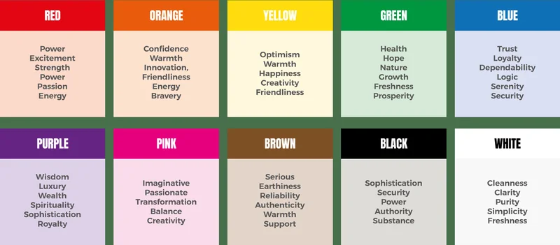
While the region and cultural background one grows up in greatly affect the underlying meaning of a colour, there are some meanings attached to colours that researchers agree to have an almost universally similar effect. Using this knowledge, different industries and designers use colours in interesting ways to influence the observer or consumer.
Here’s a breakdown of how colour is used in some industries:
Branding, Product Design, Marketing:
Based on one’s audience, and a colour’s reception in print, and on the web, marketers and advertisers use colour to evoke particular emotions or feelings with a product. Another trick long used by professionals is the name they assign to colours; while brown might be boring, mocha is intriguing. Especially with makeup products, research reveals that when asked to choose between two products of the same colour – one with a simple, straightforward name and the other with a fancier name – consumers chose the latter.
When assessing a brand or being introduced to a new one, consumers often look at the logo to make initial judgements. Depending on whether a brand is trying to sell functionality, or a particular mind-set and attitude, using the right colours in a logo can immediately convey their message to consumers. The use of colour can essentially communicate a particular personality for the brand. For instance, Coca-Cola has an almost worldwide dominance on the colour red, which evokes strong emotions from love and energy to hate and anger. By boldly using it in their branding, they have unfailingly associated their brand with red and all its strong passion.
Interior Design:
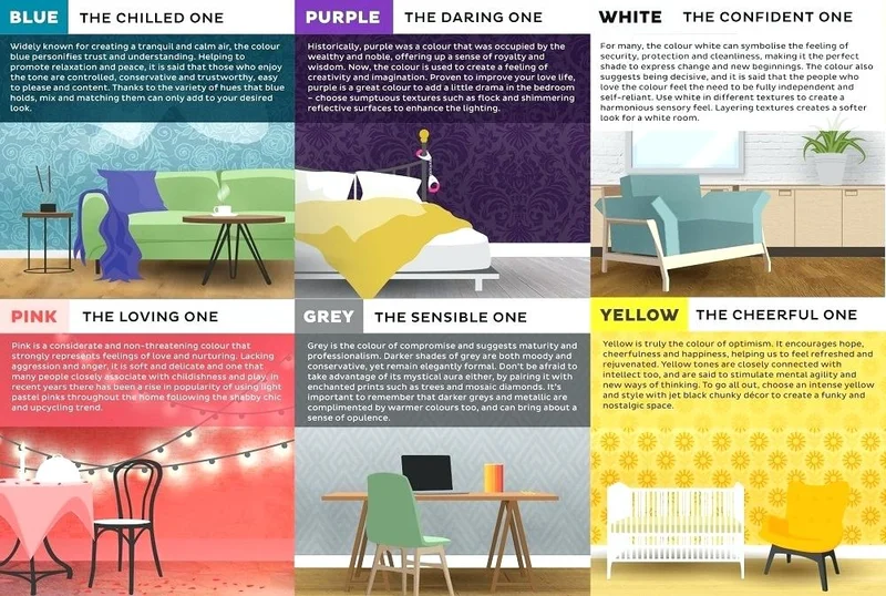
Hospitals and corporate offices prefer neutral tones like whites or greys, or cool tones like blues or greens, to help employees stay calm and encourage productivity. Offices that focus on more creative work will prefer brighter, warmer, more energetic colours.
In shopping stores, cool colours exude a feeling of relaxation, thus encouraging consumers to stay longer and shop with more deliberation and calm. On the other hand, if one wants to encourage impulse buying, stores with warm interiors fare better; colours like yellow and red make people less rational and make them feel the urge for immediate action. Conversely, cool colours are probably not as good an idea for a restaurant’s interiors, since their calming effect leads to reduced appetite. However, warm colours spread a feeling of comfort and increase people’s appetites.
For personal use, the colour will depend on the activities performed in the room, the effect of sunlight, and the size of a room. Brown, which otherwise seems like a boring colour, is a popular choice in homes because of the feeling of nature and comfort it brings. Most importantly for home interiors, one must understand the persons who will live there, what they expect to be doing in each room, and how they want to feel.
Fashion:
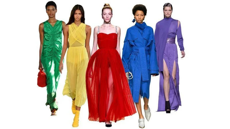
Fashion designers and fashion houses use colour as a form of personal expression. The colour one chooses to wear often suggests something about the type of person they want to be seen as, and the type of qualities or personal image they want to be seen projecting.
For instance, black unequivocally evokes power and authority, resulting in judges’ and lawyers’ clothes, business suits and so on. Black also seems more aggressive, which is how these professionals want to be perceived. The same black, however, when worn by sports teams, was found to receive more penalties because of the colour. Red is, perhaps evolutionarily, a popular attraction for heterosexual couples, since it is culturally associated most strongly with feelings of love. Blue is most recommended for job interviews since it shows calm, confidence and loyalty. Blue is also the most popular, with jeans being everywhere. Yellow most strongly draws the eye which is why raincoats for policemen are often fluorescent colours.
From using accent colours in outfits to jumbling together warm and cool colours, and experimenting with the look of colours on different fabrics, fashion offers one with a constant canvas on which to express personal identity. Colour psychology is complex and hard to define, since each colour’s associations are different, being highly individualized. Each colour’s hue and chrome, tone and strength, all affect the colour’s perception. So, while a light blue may be calming to one person, a deep blue may be chaotic, being a note to the claim that ‘blue is calm’. It is important to keep in mind that with colour psychology and the correct use of colour, context is the most important thing. Finally, while colour psychology is a science, the use of colour is also an art; feeling your way through colour and understanding it on your own terms can be very beneficial in a personal sense.