Fonts play a crucial role in beautifying certain objects as well as places around us. You might have never given a thought to how fonts make a huge difference. Nike, Unilever, Coca-Cola, Mc Donalds, Hugo Boss, Google, The New York Times, Nickelodeon, and all other big brands are easily identifiable because of their logo and font. It’s all the magic of typography and the designer who creates such quirky, stylish and unique fonts.
Although we have heard of the word typography, we don’t really know what it entails. Typography falls under the larger umbrella of design. It is the art of creating or carving out variations of letters with the motive of inducing certain kinds of emotions to be perfectly associated with a brand, store, geographic location, product or even a time period.
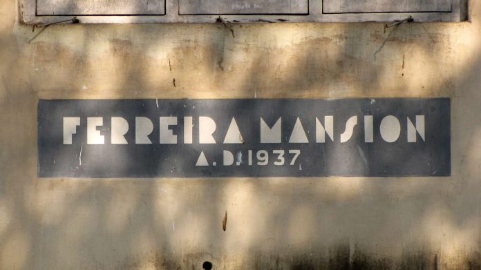
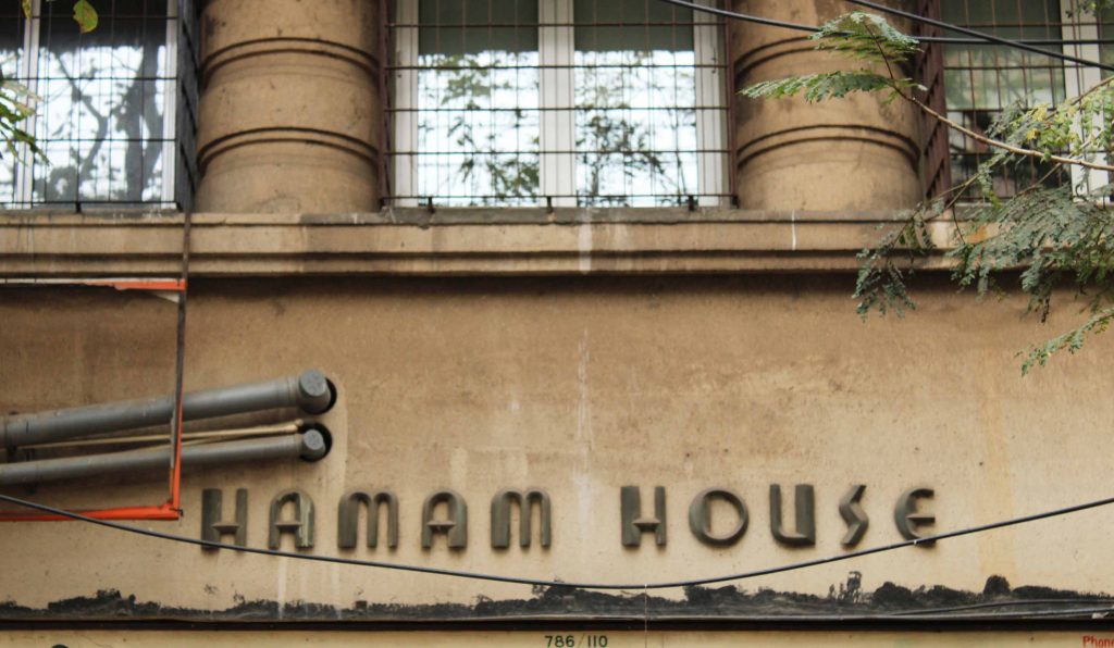
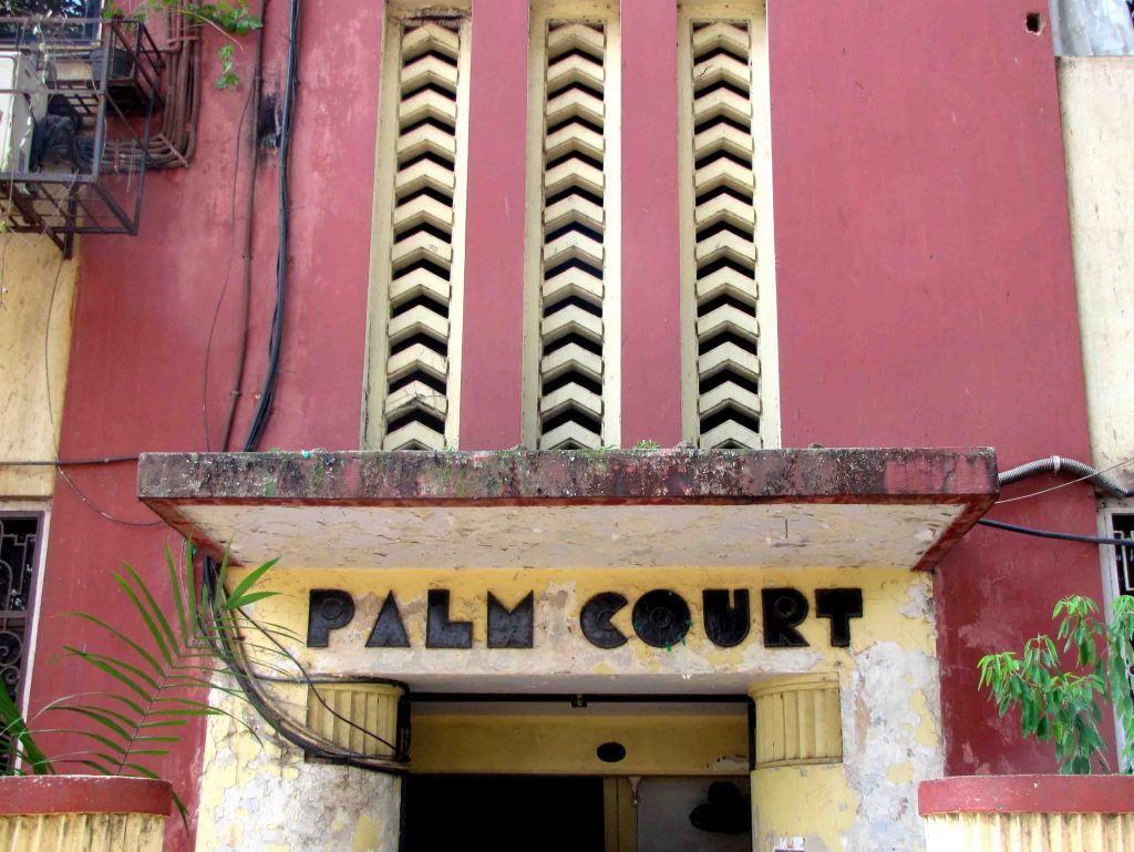
The most classic example of the beauty of typography is the city of Mumbai. Mumbai is still home to old structures built during the British era. They carry some of the most beautiful fonts ever seen which are worth admiring. Indian movie posters are yet another example of catchy type fonts. They all are a testament that it is not just an image, sentences, videos, music, sound or video clips that can induce feelings, fonts can too.
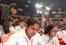
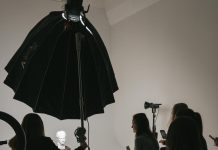
I was recently introduced to the world of Typography through a workshop that took place at Khotachiwadi, Girgaum, Mumbai. The Art Deco Typography workshop was conducted by Miss Tanya George, a designer and researcher. She shed light on various aspects of fonts with examples explaining the shapes and sizes, the geometry and symmetry of the letters, what a lower waistline and counter spaces are, and the purpose of their styling.
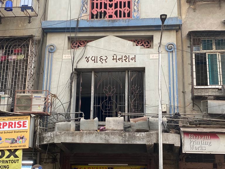
She then had all her participants engage in a fun activity that allowed them to play around with a single letter. Everyone was given one letter to stamp on a piece of paper. Tanya then asked each one to replicate the letter by joining the letter’s endpoint. Followed by this, she encouraged them to create different variations of each letter without necessarily having them be correct or incorrect. She said, “as long as you see a letter in your creation and make sense of it, everything is correct.” The participants were then asked to pick the most favourite variation of theirs and draw it on a larger scale.
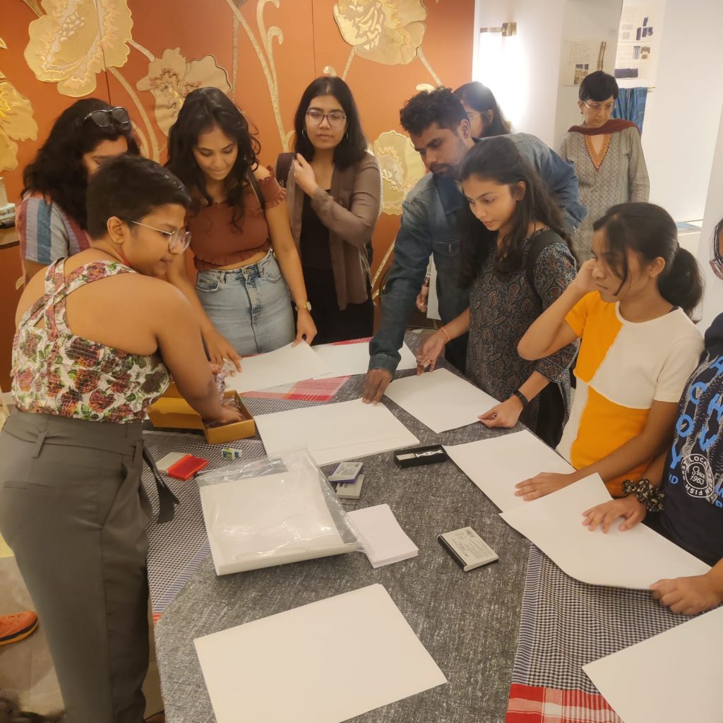
The activity was fun and it made me realise how creativity truly knows no bounds. One can keep experimenting with letters, play around with them, and create a completely different font type altogether, and yet never really see an end to it. It was a good mental exercise too as it pushed the mind to think in different and unconventional ways to draw a letter in different forms.
Typography was a new-found field of profession for me. In a world that is visually driven, the workshop made me imagine the amount of scope a career in typography holds.


