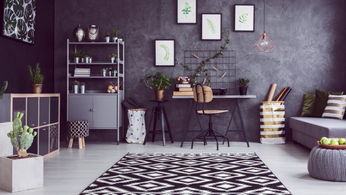
Interior design is part design and part performance art, demanding clear communication between the space and the occupant. Successful interior design focuses on three things: function, mood, personality. Good physical surroundings, that match ones’ personality, allow not just for happiness and productivity, but also drastically reduce unconscious stress, leading to comfort and generally improving ones’ life. Of course, it is art, and there are no rigid rules that are universally applicable. However, here are some basic rules of interior design to keep in mind, which can be used and understood in a myriad of different ways and are going to helpful:
Colour
The colour of and in a room has the most visual impact of the viewer and creates a particular mood or feeling in it. The most common recommendation is to use three colours in a room. Here are suggestions on how to bring them in together:
The 3/3 vertical rule: Outlined by Mark McCauley in his book Colour Therapy at Home: Real-Life Solutions for Adding Colour to Your Life, this rule is based on nature and the outdoors. Responding to people’s desire of bringing the outdoors into their homes, McCauley suggested that colour be used as an imitation of the outside. He says that the darkest colours should be at the bottom, lighter in the middle, and lightest at the top. This mimics nature where the roots and base are the darkest, trees and foliage lighter, and the skies the lightest, during the day.
The 10-30-60 rule: Another rule related to colour, this helps one decide the proportion of different colours or hues in a room. The dominant colour will take up 60% of the room, while the secondary shade is 30% and accents are 10%. While the details are highly individualized, generally the dominant colour is a neutral or light colour, covering the walls and flooring. The secondary colour is usually slightly bolder and fit for signature furniture pieces. And finally, the accents are the boldest colour and are usually reserved for accessories or a single wall.
The Rule of Threes/Odd Numbers
Similar to the rule of thirds in photography, interior design can also benefit from groupings of odd numbers. Visually, grouping items like accessories together can look very appealing when done correctly. Odd numbered groups generally look better than even ones. Within these, three seems the ideal number, one being too little and five or seven seemingly cluttered. These groups can be different but should have some unifying thread, maybe a colour or a shape, tying them all together in the group. [Tip: the rule of threes is applicable not just for accessories, but also colours, patterns, furniture – remember, measured repetition brings harmony and flow].
Layered lighting
It is easier to play with lighting once you understand the different types of lighting:
- Task lighting: these lights are there for a specific purpose or task, like bedside lamps
- Accent lighting: these lights highlight a particular part of the room or a specific piece
- Mood lighting: these are the general colours that light up the room, and depending on the use of the room, the mood lighting can be played with
Pay attention to the lighting of the room, depending on its purpose. A kitchen will be brightly lit while a bedroom will have more focused lighting. Make sure there is more than just one source of overhead lighting to bring more life to the room. Experiment with different colours, from different shades of white light to yellows and lighter colours. Bring in lamps and strings of light that also look great as accessories when turned off. Where possible, allow access to as much natural light as you can, since this is good for health and has a much greater effect on the room.
Space
Every room has a positive space, where there is furniture or something else in the eye-view, and negative space, which is essentially empty space and allows the eye to relax. Use each inch of space creatively. Don’t be afraid of the empty, negative space, and don’t give in to the temptation of filling every part of the room with an object. With negative space, avoid clutter and make sure each negative space serves a purpose. [Tip: For smaller spaces, you can use furniture as statement pieces].
Also focus on taking accurate measurements before you start, thinking of the space and the furniture you bring in. The scale of the components compared to the room can completely alter its look.
Focus on the room’s focal point and centre point. The focal point is the part of the room where the eye naturally looks as soon as you enter it; emphasize this with a frame, mirror, or some other statement piece. The centre point is commonly the centre of the room, dimensionally, and is a great area to place a bed or a coffee table with seating surrounding it.
Other rules to keep in mind:
- Mix materials and textures
- Take risks with accessories
- Express yourself and make the room look like your personal space
- With purchases, choose what you love over what’s currently trendy
- Reference the rules, but finally, follow your gut!


